I conceptualized a pop up, its marketing strategy, brand identity, and event experience. The Up Pop Up educates and empowers consumers to become agents of change through upcycling.

This 7 day pop up would include DIY workshops, panels, dialogues and lectures by authorities on the subject of upcycling. The grassroots marketing strategy revolves around building an online presence through social media. Partnering with companies such as Sainsbury’s would allow us to leverage their brand recognition to advertise on existing packaging, eliminating excess print waste.
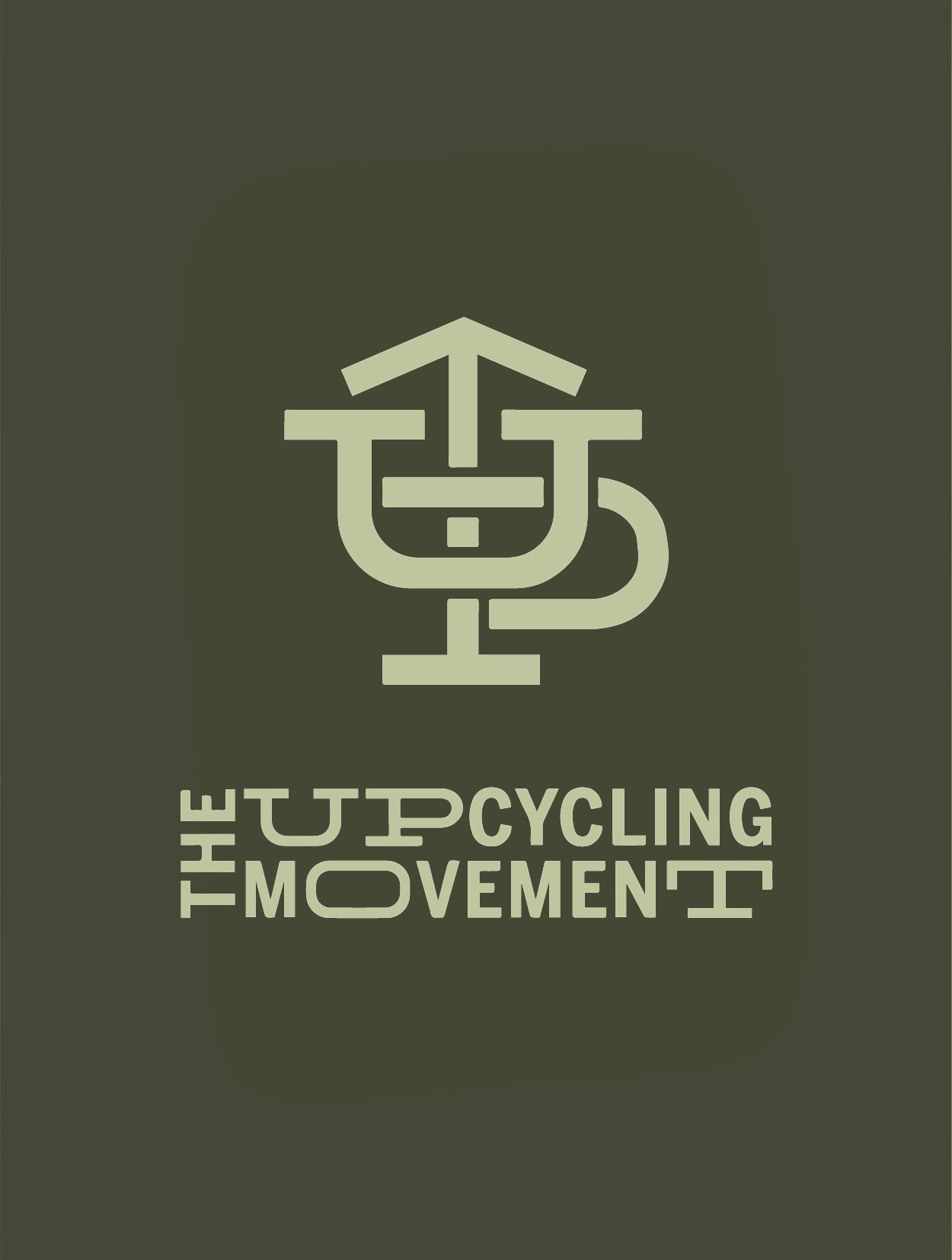
The logo and the custom typography of the brand reflect the agility of upcycling itself: disassembling, reimagining, and reconnecting forms to create new things. The energy of the custom type creates a sense of urgency and call to action while embodying movement and hands-on crafting.
WHAT I DID
brand identity
logo design
typography design
marketing strategy
web design
WHERE I DID IT
Case Study
University of the Arts London, Central St. Martins
WHEN I DID IT
2014-2015